Please include the University logo on all of your materials to show a clear link to UNC Asheville and to display University pride.
Consistent use of our logo strengthens recognition for UNC Asheville and helps build a unified brand. Please include the University logo on your marketing materials to show a clear link to UNC Asheville and to display University pride. The University logo should be shown in its entirety, with both the A and University name unbroken and unaltered.
Please closely review the Logo Usage Requirements below.
The University’s academic logo was adopted in August 2005.

Horizontal Logo
Vertical Logo
Logo Usage Requirements 
University Logo Guidelines
Do ✓
The University logo should be shown in its entirety, with both the A and university name unbroken and unaltered.
Colors & Orientations
The logo should appear in UNC Asheville blue, white, or black, as circumstances require. The best orientation will vary depending on the material and space available, so choose the version that suits your needs.

Spacing
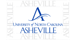
The minimum amount of clear space required around the logo is defined by the height of the word “ASHEVILLE.”
Minimum Size
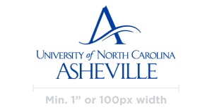
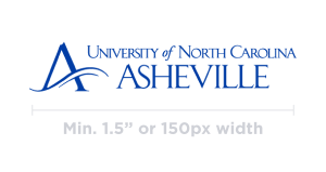
The vertical logo should never be used at sizes smaller than 1” width in print or 100px width in digital applications. The horizontal logo should never be used at sizes smaller than 1.5” width or 150px width.
*Note: If you need a smaller-sized logo for promotional materials such as pens, e-mail Communication & Marketing for assistance.
Don’t ✖
No alterations should be made to the logo; it must be reproduced from officially approved master artwork. Avoid re-creating any versions of the university logo; do not use scanned or poor-quality reproductions.
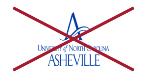
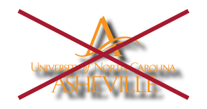
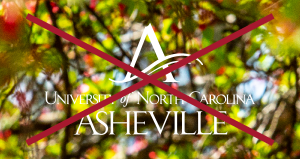
Do not stretch or distort the logo. Do not add special effects, shading, or outlines. The logo should not be placed over a busy patterned or photo background that interferes with logo legibility.
Use of the A Logo Mark
Whenever possible and where space allows, the University logo should be used in full.
It may be appropriate in some circumstances, such as the small spaces available on social media, to use the UNC Asheville signature A as a design element. This logo mark may only be used as a design element separate from the full logo if the full University logo appears elsewhere in your communications (for example you might see the A on the cover and the logo text on the back cover, or you might see the A as a header and the text as the footer).
When you encounter a case where the logo will not fit, please email Communication & Marketing to review or develop a custom application. For instance, on pens, pins, and lanyards, the logo will need to be resized to fit. We are happy to connect directly with your department or the printer/vendor to implement the design.

